
App Design 2025
Placie App Design Project

Placie aims to create a connected environment for users to find and explore places they are interested in or likely to be interested in through a personalized places recommendation feature. It allows people to explore restaurants, cafes, and tourist attractions easily and effectively through gamified interfaces.
Timeline
10 Weeks
(Spring 2025)
Role
UI/UX Designer
User Researcher
Prototyping
Collaborators
Individual Project
Tools
Figma
PROBLEM
The current mobile app that users use to find places lacks a personalized recommendation feature. Currently, there is an app that recommends restaurants, cafes, and places to visit; however, these features are separate and do not integrate.
PROPOSAL

USER INTERVIEW

🔗
Semi-structured Interview
Number of Interviewees: 3
To gain insights, I conducted semi-structured interviews with three interviewees. From the interview, I gained insight into the user’s pain points with the current mobile app and some ideas for features.
FINDINGS
Target users are high-technology savviness people who want high-quality, straightforward, and gamified fun interfaces.
Users wanted a straightforward mobile app that has a personalized recommendation feature.
Users are familiar with finding places using community-oriented apps, such as Reddit, TikTok, and Instagram.
PERSONA & USER NEED STATEMENT
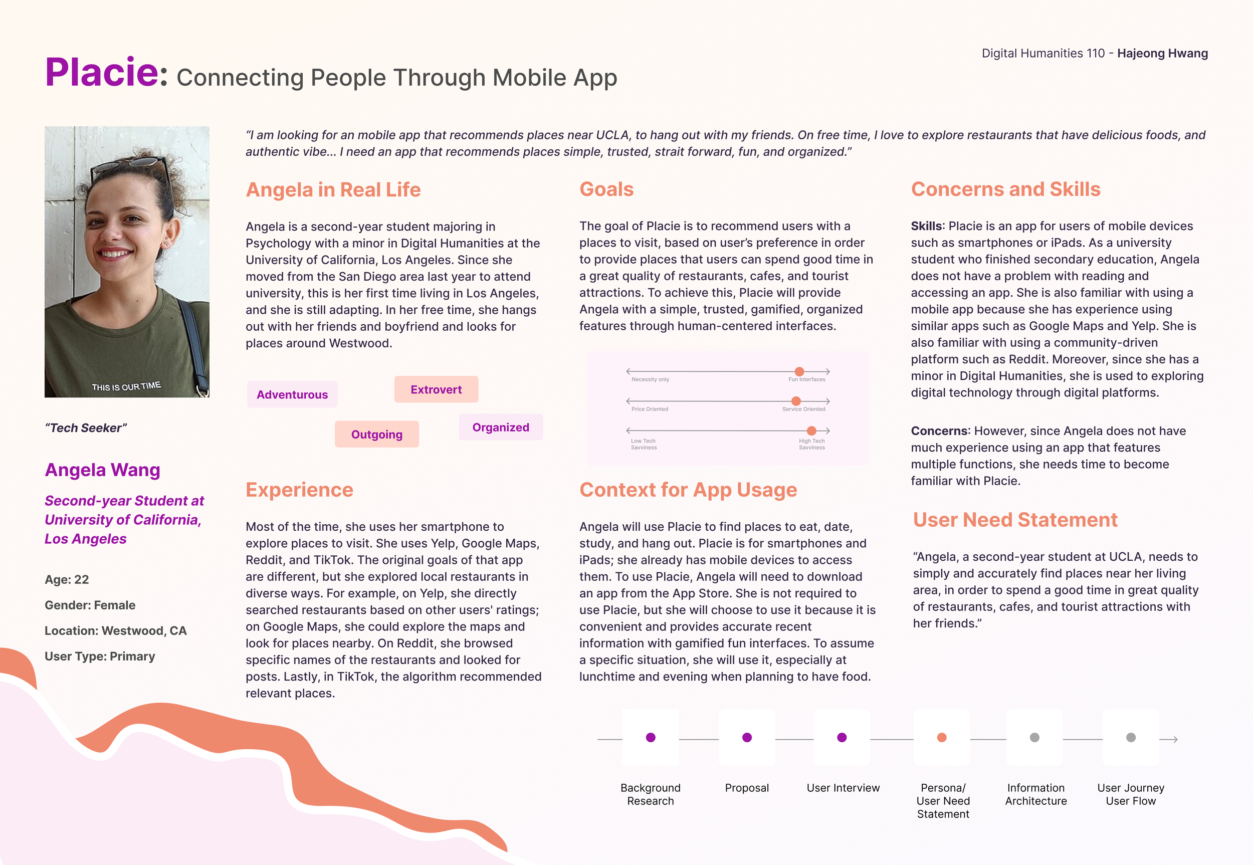
Based on the interview results, I created persona and user need statement, referring to the NNg’s article.
For the user need statement, I followed the 3 part format, “[A user] needs [need] in order to accomplish [goal].”
SITEMAP

The sitemap includes all important pages and content. It shows where the website’s contents are located. I used two different colors to fill each boxes to identify the priority of pages and elements.
NAVIGATION SCHEME
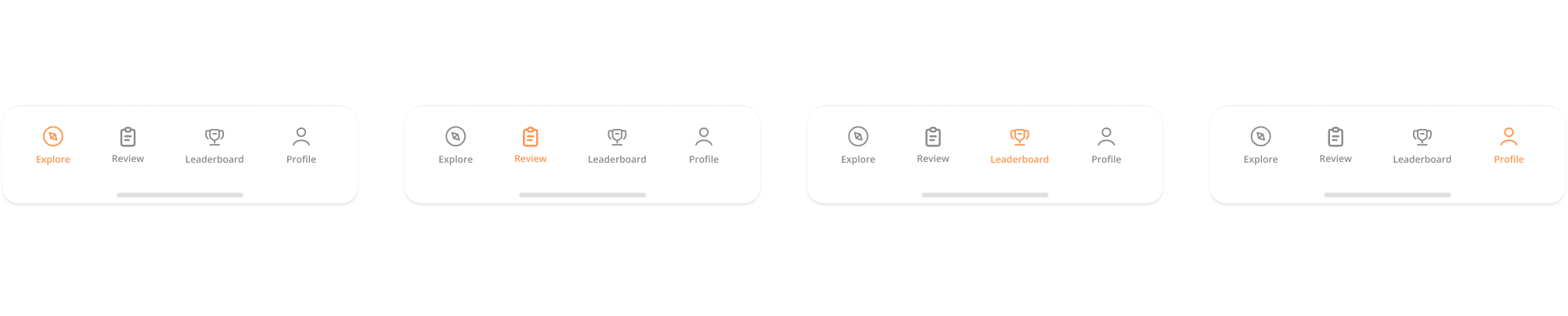
Placie's navigation scheme aims to provide users with an accurate and seamless experience. Placie’s navigation bar allows users to navigate four different pages: Explore (Home), Review, Leaderboard, and Profile. It includes only essential pages, allowing users to quickly and easily access the desired page with minimal cognitive load.
Placie's navigation bar shows the page's name below the simple icon in small font to reduce confusion about each page. The Navigation bar is located at the bottom of an app, enabling users to easily navigate to different pages within thumb's reach. Additionally, when users are on a specific page, the icon for that page is highlighted in a distinct color from the icons of other pages. All color schemes, icons, and fonts are optimized to enhance the readability and recognition of each page.
USER JOURNEY MAP
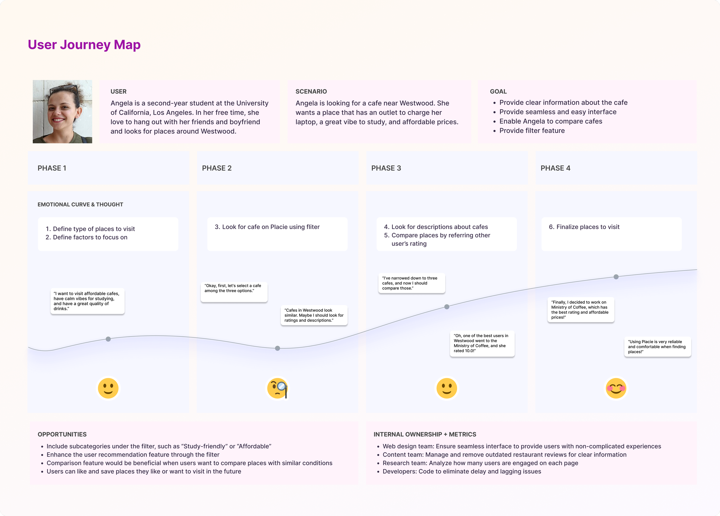
The user journey map illustrates the process of interacting with an app when the user accomplishes their goal and navigates the app when they first use it. Referring to the format of the consumer journey map, this user journey shows scenario, goal, emotional curve, opportunities, and internal ownership.
USER FLOW

The user flow shows the process of the user’s journey in step-by-step when they complete a task when they create account and explore each pages.
DESIGN
Wireframing
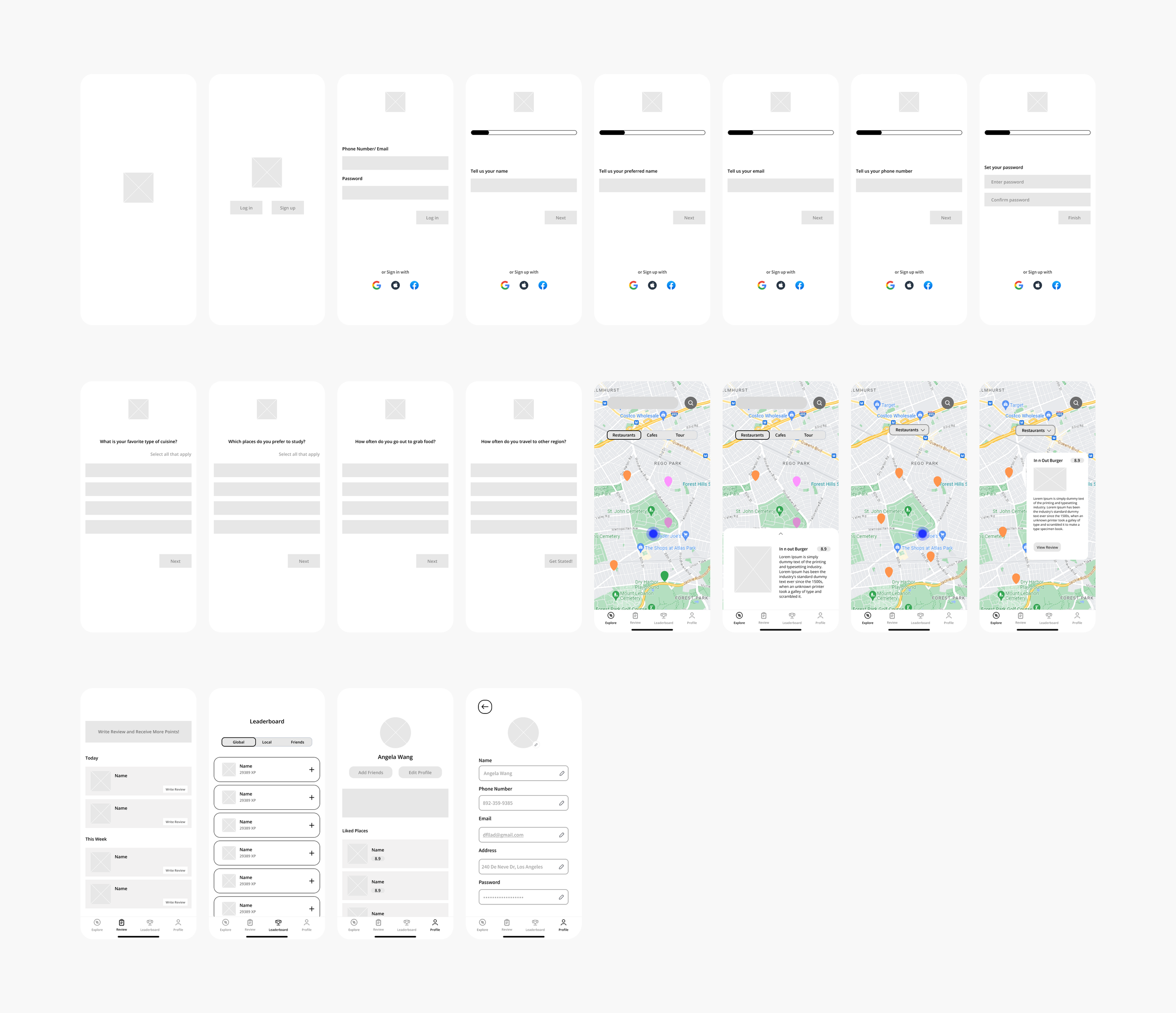
After finalizing the structure of Placie, I created an app’s wireframe using Figma. I used Black, Grey, and White to sketch an app simply.
FINAL DESIGN
The final design illustrates the structure of Placie. Focusing on three key findings from user interviews, Placie provides personalized recommendations that automatically prioritize the places where users look on the explore page. Moreover, gamified interfaces make users more engaged in the app’s community, for example, accumulating XP and leaderboards that encourage users to compete with their friends and global users.
PROTOTYPE
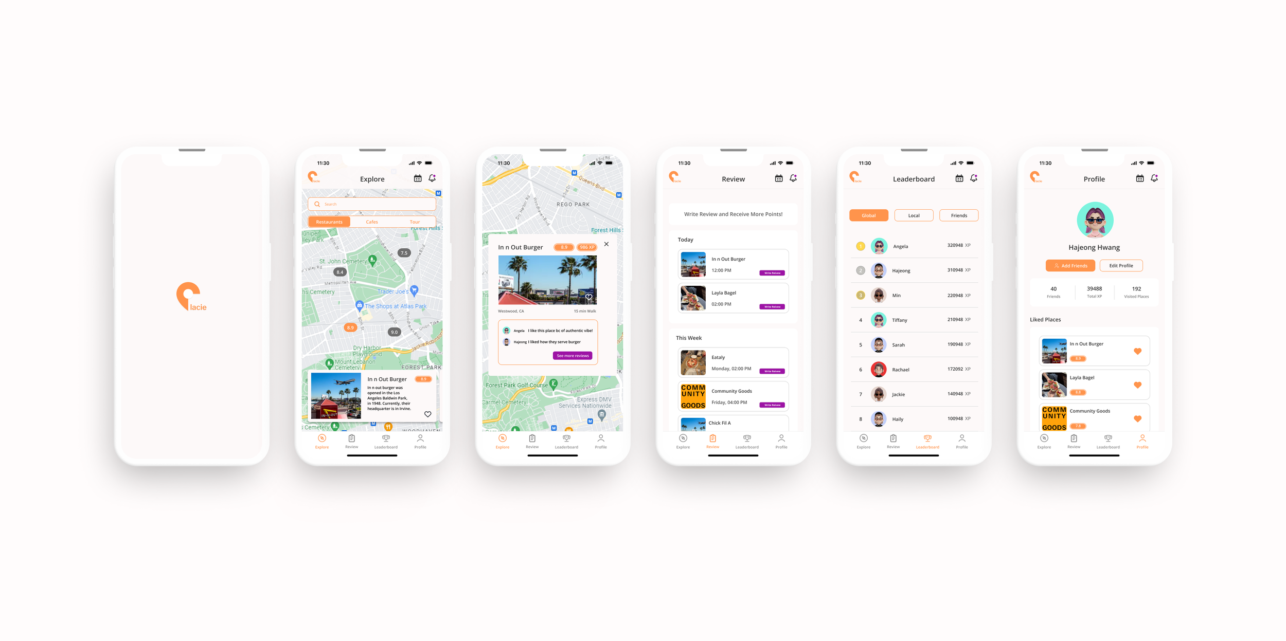
Onboarding
Through targeted questions, Placie identifies users’ preference and recommends the places that user wants.
Explore, Review, Leaderboard, and Profile
The Explore, Review, Leaderboard, and Profile page allows users to find places using filters, accumulate XPs, and see other users' rankings in global, local, and their friends' rankings.
BRANDING
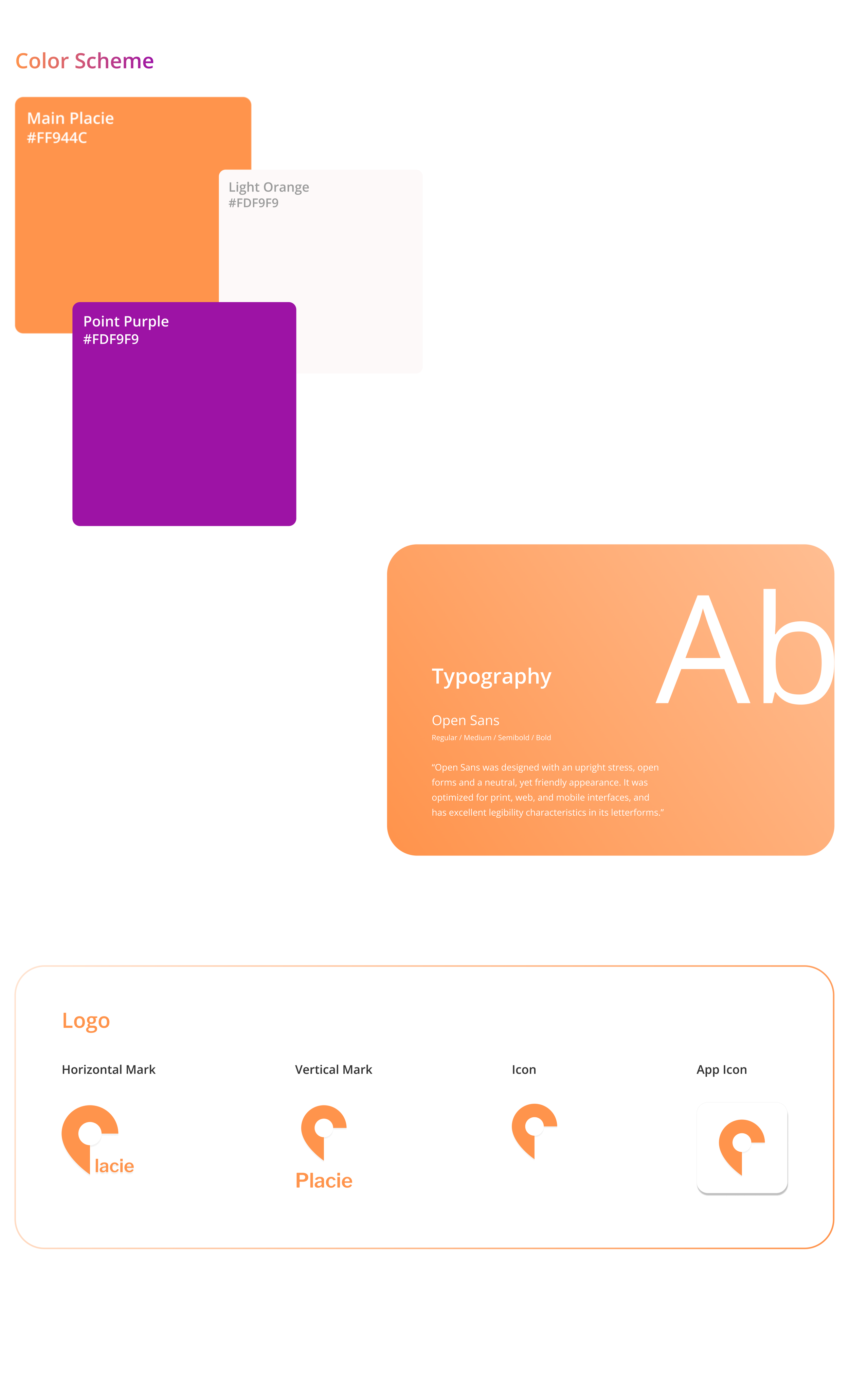
Before designing an app, the first thing I did was to decide on the colors that would represent Placie. Since I was planning to use orange as the primary color and Purple as a point color, I was able to set four colors that represent Placie: Main Orange (#FF944C), Light Orange (#FDF9F9), White (#FFFFFF), and Point Purple (#FDF9F9). Orange, which is between red and yellow, and Purple, which is a color between blue and red, are both secondary colors, which are mixtures of primary colors. Additionally, they have a vibe of warmth and coolness, but they are not in a fully complementary relationship. Therefore, it attracts users with a contrasting yet harmonious vibe, yet in a Triadic relationship.
For the typography, I chose text grey (#6E6E6E) and text black (#323232), using the Open Sans font.
After deciding on a color scheme and font, I created a logo in which I modified the location icon to represent “P” and added the rest of the letters using the font (Libre Franklin). As a result, I was able to design a logo that represents Placie and, at the same time, encompasses the meaning of a map.
🔗
USABILITY TESTING
After prototyping using Figma, I conducted a usability test with two potential users, asking them to conduct tasks corresponding to the user test goal: “View restaurant reviews on Placie after signing up and creating your account”
The usability test was successful, although a minor error occurred in the app during user completion of the goal, specifically on review pages that allow users to write both public and private reviews. However, it was meaningful to hear some suggestions, such as a separate diary and review feature, adding estimated ride times, and a feature that allows users to share their diary with friends. From the usability test, it was meaningful to hear some opinions on great things about Plaice and some suggestions for improvement.
🔗
REFLECTION
As a university student aware of the limitations of current mobile apps used by users to find places, it was meaningful to understand my peers' pain points and provide a solution by designing a mobile app.
It was meaningful for me to conduct every step of the human-centered design process, including user interviews, user personas, sitemaps, navigation schemes, user journeys, user flows, wireframes, app designs, and usability testing.
If I could collaborate with front-end and back-end developers, I would release Placie on the App Store and add an algorithm feature to it.